Dr Pepper
Packaging
2019
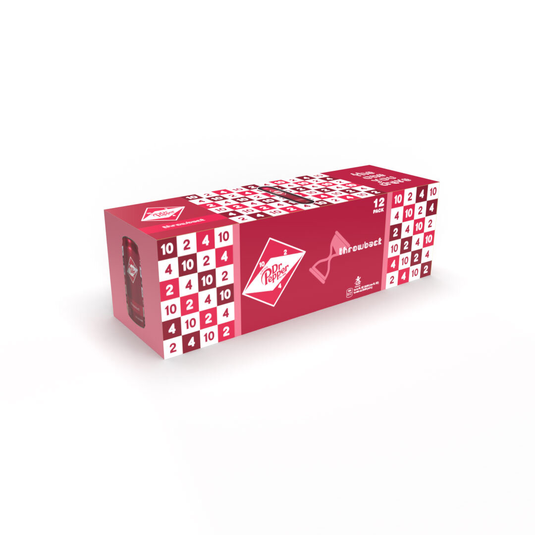
For my packaging design class, I was tasked with redesigning an existing product's packaging, my choice being Dr Pepper. The old saying "Drink Dr Pepper at 10, 2, and 4 o'clock" and its accompanying clock image really struck a chord with me. I reconfigured the clock shape for the logos of the three flavors: Cherry Vanilla, Chocolate Orange, and Throwback. The 10-2-4 idea also came into play with the Throwback pattern. For the other two patterns, I wanted to mix the abstract with concrete. I used white waves and cherries made out of semi-circles for the Cherry Vanilla pattern. The Chocolate Orange pattern is a grid of chocolate covered oranges alongside orange circles and brown squares overlapping. My hope for all three was to have a retro yet timeless feel. Keeping that idea in mind, I had to then create ads for the products, so I figured why not do them in the style of comics?